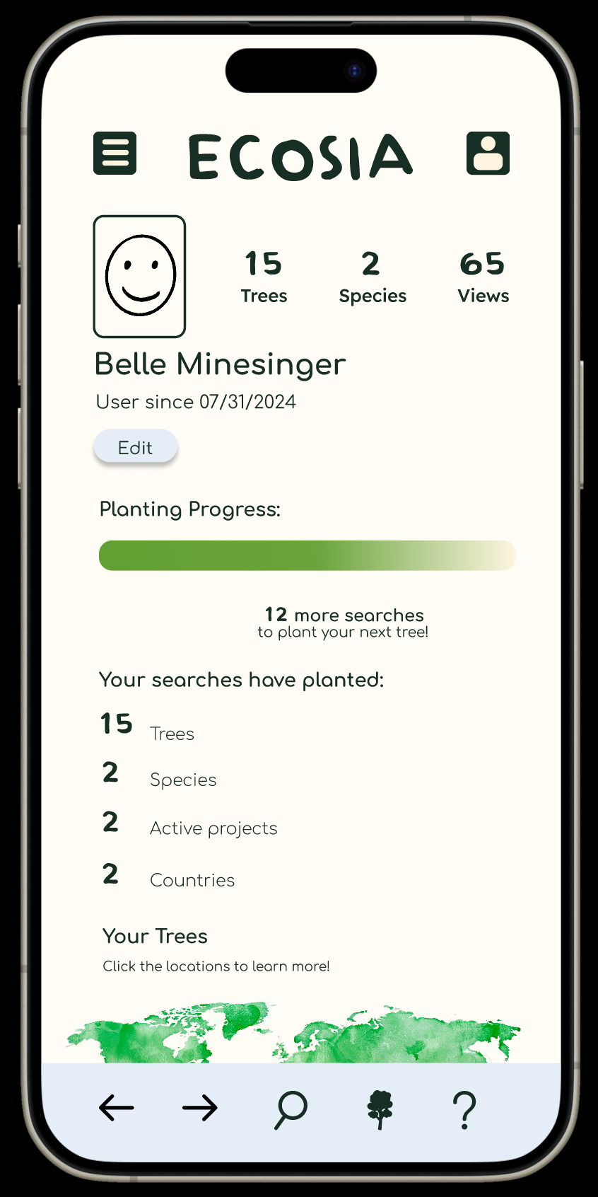
Ecosia Mobile App
SUSTAINABLE WEB BROWSER
This is the full brief of the redesigned Ecosia browser, Ecosia is a CO2 negative browser extension by using renewable energy and planting trees. It powers its servers with solar energy and invests its profits into tree-planting projects, which absorb more CO2 than the company emits. Ecosia is a CO2 negative browser extension by using renewable energy.
Research
Who is our audience?
Audience interests reveal key details on the browsing interests of ecosia.org's visitors. ecosia.org's audience is interested in Computers Electronics and Technology > Computers Electronics and Technology - Other & news.
Who is your ideal customer?
The ideal customer is someone who want to make an easy switch to be more sustainable. Statistics show most people who use the app are using it to search for everyday needs.
What are their demographics, habits, and goals?
Audience composition can reveal a site's current market share across various audiences. ecosia.org's audience is 42.41% male and 57.59% female. The largest age group of visitors are 25 - 34 year olds.
Personas
The goal for these personas is to research the users of Ecosia. This part of the research proces is critical to a successful outcome. Understanding the users wants, needs, and issues navigating the site helps me understand what this redesign needs to do.
Chris: This persona satisfies the younger audience that uses the app. They understand how to navigate technology and the impact of their decisions when it comes to sustainability.
User flows
User flows help identify the steps our users take to navigate the site for certain tasks. They also help identify “pain points”, also known as areas where the users have trouble navigating the site. I decided to make user flows for Chris and John, as they are on opposite sides of the spectrum of users.
Chris: For Chris’ user flow I decided to have her navigate through the browser to resolve a question. This is a highly common use of the browser extension so I wanted to make sure one of the personas was identifies navigating the site.
Benchmarks
Google
Googles home page is not as simple as their website application. The screen also presents the user with the weather, air quality, and suggested searches. Google now has an AI feature called Gemini. Google has your profile linked to the circle in the top right corner of the header. I like how their is a pop-up screen instead of taking the user to a new page. It allows for the user to use the app more efficiently. Google is the “go-to” option for users when deciding which browser to use for their search. This is because of the personalization abilities as well as the wide rage of uses across the Google applications.
Yahoo
Yahoo has a bright and colorful color pallet which I like. The home screen in more simple than Google. Yahoo also incorporates icons which continue to free up space on the page. The footer is simple, only using icons for the home page, search engine, and settings. The settings page includes your profile, the help section, about, and ways to manage other accounts. There is no profile icon, it is embedded into the settings page. This creates for space on the phone and leads the users to one place for all their corresponding needs.
ia heiarchy
Wireframe sketches
Wireframe ideation
In the beginning stages of ideating the wireframes I explored different layouts, hierarchy, and colors.